Designing an Online Store
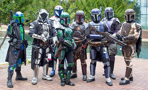
The Mandalorian Need
Mando Starforge provides digital and physical tutorials that help cosplay hobbyists, specifically Mandalorian and other Star Wars themed cosplayers, to construct their costumes and props, and needed a website to sell that merchandise and content.
My Role
I generated the design artifacts which included:
- User Personas
- User Journeys
- Site Maps
- Storyboards
- Wireframes
- Test Reports
- Low Fidelity Prototypes
- High Fidelity Prototypes
- Design System Component Library
- Design System Styles Library
As one of the primary merchandise and content creators, I started this job pre-equipped with some assumptions and biasses. While I knew those assumptions could help me design for customers who shared my similar goals and needs, I kept in mind they could lead me to underserve those who don't.
Time Constraints
Due to severe time constraints, the development of the style and patterns guide and the accompanying design system would need to happen in conjunction with the prototypes.
The Cosplayer Persona
To inform my design decisions, I had to get into the mindset of those who would visit the site.
I took the information gained from previously taken research, analytics, and user interviews and created an affinity diagram to develop the primary user goals.
Main customer goal themes:
- Find costume and prop creation guides
- Find costume prop cut patterns
- Learn about EVA foam armor and props
- Find out where to get materials and tools of the trade
- Find costume inspiration for personal projects
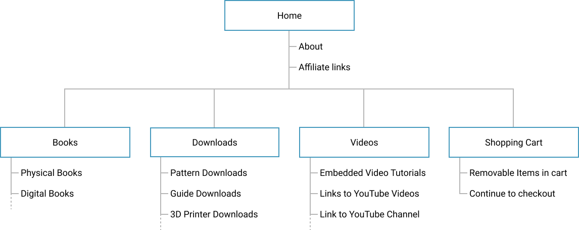
Site Map
Style Guide
Because we were going to create a design system and a design patterns library, the decision was that there would be no need for a separate style guide. The design system would hold the styles, and the patterns library would inform their usage.
Design Patterns Library
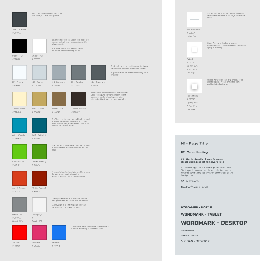
Before I jumped to into building components in Figma, I started a pattern library with the basic units, fonts, colors, and other styles.
Units
Units for image sizes, font sizes, and component spacing/sizing would be base-8. Generally, this means that pixel dimensions would be multiples of 8. For example, 8, 16, 32, 64, 128, 256, and so on. Some exceptions were midway points, such as, 12, 24, 48, etc.
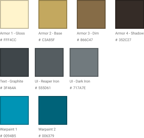
Colors
I had developed the branding prior to this project, but additional colors would need to be added as needed.
First Prototype
Through a couple of workdays and several iterations, I had our first low fidelity prototype, ready for testing.

Problems found:
- People would often pause to process what they were seeing and how to proceed.
- didn't know how many items they had placed in their cart.
- didn't know if they were able to remove items from their cart.
- didn't always know what would happen when they tapped on a product card.
- usually didn't know what an affiliate was within the context of the site.
- would sometimes navigate away from the cart due either to distraction, or confusion.
- would sometimes assume "Checkout" button to have a similar function as the "Add to cart" button.
- often skipped over the "About" text.
- would sometimes assume that tapping the "Video" card would play the video, others would assume it would take them to another screen.
- People who were new to the brand found the "about" text to be confusing and uninformative.
- People who had little to no knowledge of what cosplay was, found difficulty understanding the purpose of the site.
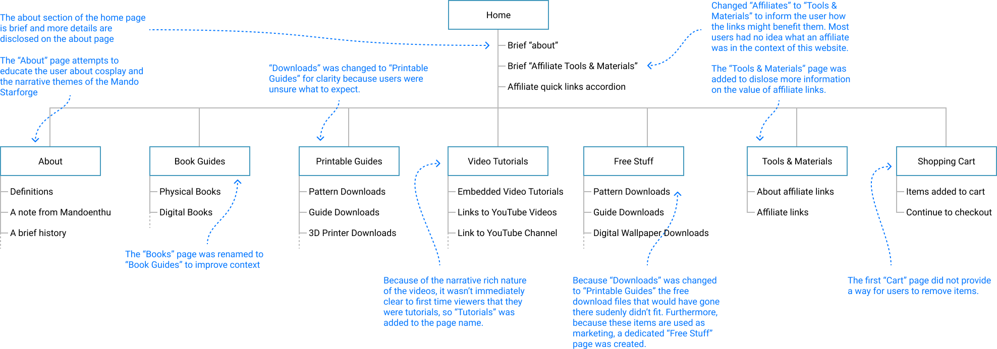
Updating the Site Map
The results of the first round of user testing provided some actionable insights into ways I might improve the site map.
Updating the Design
With the user testing takeaways, I made the following changes:
- Applied progressive disclosure principles to much of the components, like "About" and "Affiliates (now Tools and Materials)".
- Changed the "About" link text to give a definition of "Cosmando" with a nudge to learn more.
- Added an "About" page, which included definitions, words from the semi-fictional lead character of the videos, and a semi-fictional history of the brand narrative.
- Added a "Tools and Materials" page, which included information about what the value of affiliate links.
- Added a "Tools and Materials" quick-links accordion to the bottom of the home page.
- Changed the page link buttons from dark tiel to match their perspective page header images.
- Added a visual tag to product images to inform the user of the category it belonged, i.e., Book, Printable PDF, Video, etc.
- Added an action button styled bar at the bottom of each product card with a label to inform the user what will happen if they interact with it. i.e., "View Book", "View PDF", "View Video", etc.
- Added a floating cart to the side of the screen.
- Made it so the header menu would float to decrease user interactions and cognative load.
- Added a "remove item" function to each item in the user's cart on the cart page.
- Removed page and affiliate links from the cart page to reduce the ammount of distraction and confusion before a transaction can be made.
- Changed the "Checkout" button to visually stand out from the "Add to Cart" button. Added a green color to the styles for this button.
Updating the Styles
During these iterations, colors, text styles, and effects were added to fit the needs as the project progressed.
The Design System
I built the design system in conjunction with the prototypes, which is where all of the master components that made up the prototypes rested. Changes made to a master component in the design system would update its instances in the prototypes to reflect the changes. That relationship saves a lot of time compared to the old days of manually changing everything in our prototypes.
The master components depicted bellow will grow vertically as new components are added to the design.
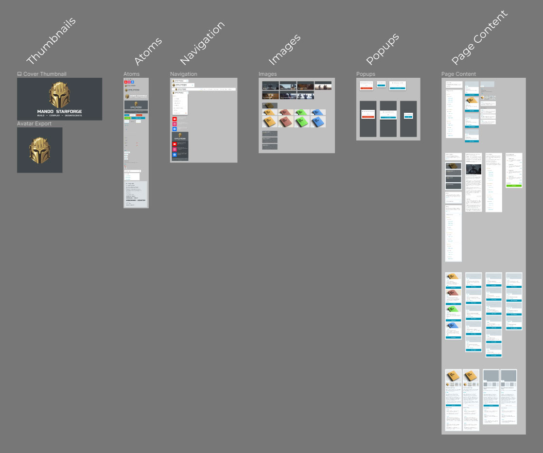
The prototype was built out of components its components from the design system library and each of those component instances will take on any changes made to the master components.
The Design System User
During this project, I designed for two different users; customers who are browsing the website and designers who will be using the system. That meant that I needed to test the design system with designers.
Naming Matters
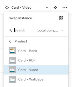
The naming of master components determines the menu hierarchy of the component library, so I needed to be thoughtful about how I named the layers and how that would affect how a designer would find the components they needed. Much of the designer's experience in Figma was outside of my control, but the naming of components wasn't, so I tested it with the designers. The test results were relatively straightforward, and the following is an example of the final changes.
The bellow image shows how I named the layers.
This example shows the quick swap menu. My goal was to only show related components that a designer would want to quickly swap between.
And finally, the library is the primary source for finding and selecting the components you want to use.

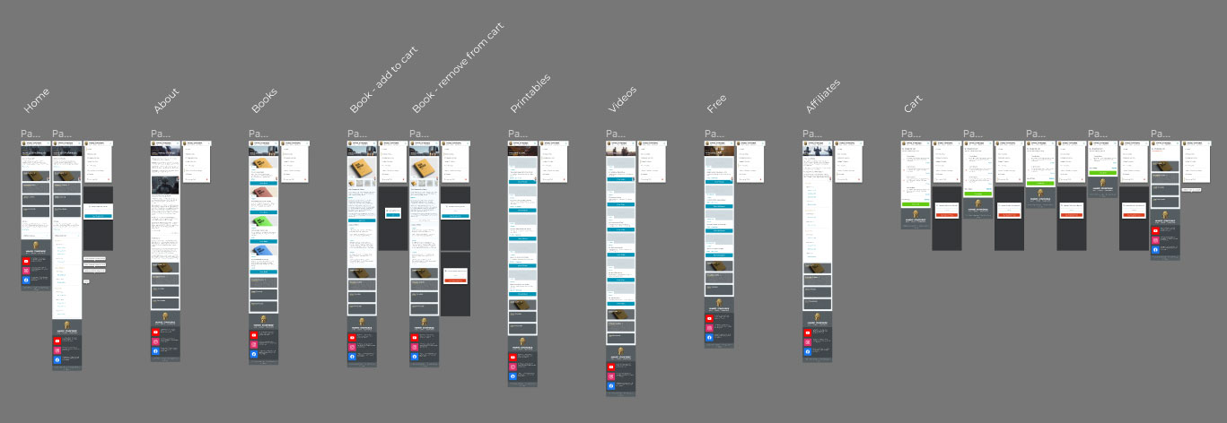
The Current Design
Once the final prototype was ready, I only had time for one more round of testing. The results did bring up some valuable insights, which ultimately resulted in a much more compact website than I originally expected.
In the past, I found that people generally didn't mind scrolling through websites with plenty of white space. However, our users tended to use the site for guidance while crafting their props, and their performance would suffer. I hypothesized that they were reserving a sizable amount of their cognitive load for their craft and that I could increase their performance on the site with some minor tweaks.
One change I made was to vertically scale-down components on the pages while maintaing clear groupings and relationships, which seemed to decrease instances of people losing their position on the page and the time it took them to reach their goals. They also showed a greater ability to compare elements for context and direction, at a glance.
Current Issues and Moving Forward
The life of this design is only just beginning. As we gather more information and understanding about the different users, the site, its content, and its products will evolve.
Open Questions:
- The images currently used don't always accurately convey the intended purpose or product. Could icons or more symbolic illustrations communicate more clearly than photographs in some instances?
- Because the "Tools and Materials" links lead the users away from Mando Starforge, it was decided only to include affiliate links to the home page and the "Affiliate Tools and Materials" page. Would it be of greater benefit to customers to include the quick links to every page?
- The headers of the different page categories look like traditional headers, but they don't have any interactivity to them. Do users try to use these headers as navigation?
Desktop and Tablet Breakpoints
This project's progress was good, and thanks to the design system, I can make future changes or shifts in direction without hours of implementation before testing them. Unless time constraints loosen, the testing cycles will continue to be fast and furious, if not uncomprehensive. That comes with its benefits, especially if you enjoy designing at rocket speed.